One bold idea: graphic design that earns its budget
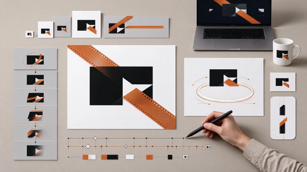
As of November 2026, the answer is yes: original design still pays, and the proof is cheap to check. The new logo for the 32nd Kolkata International Film Festival, designed by Sandip Ray, holds a black mark cut by burnt-orange film-strip triangles, and it works because of one committed idea rather than the number of elements inside it. That is the same decision a marketing team faces when it briefs a video production company and signs off a monthly creative plan: pay for one idea, execute it properly, and repeat it across every placement.
Key takeaways
- A logo can be instantly recognisable with two colours and one bold idea, and the festival's 32nd edition shows what that saves in explanation.
- Ray's design borrows a cliché, the film strip, and promotes it from decoration to the structure of the mark, which is the difference between having an idea and applying one.
- Originality in a paid campaign is a production decision, not a stroke of luck: a defined unit of work and a monthly rhythm make it repeatable.
- A designer's skills transfer to screen work far less than the brief implies, so the skill split belongs in the budget conversation, not a job description.
The logo: one idea, two colours, executed without decoration
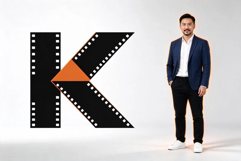
Creative Bloq reported the logo on 10 November 2026, and the timing matters for this article because the festival itself runs from 16 to 23 December. The mark is not a montage. Heavy black letters are sliced by burnt-orange triangles, each edge lined with sprocket holes so the shape reads as a strip of film. The writer's verdict is a useful benchmark for any client reviewing a design: two colours and one bold idea are all it needs to be instantly recognisable.
The harder point sits underneath the surface. A film strip is the least original element available to a cinema logo, a piece of visual shorthand as worn as a popcorn box. What changes the result is that the designer did not use the strip to decorate a word mark; he made it the word mark. Decoration can be swapped without loss. Structure cannot.
That distinction is what a client should test in a logo review. Ask whether removing the supposedly creative element would leave the design intact. When the answer is no, you are looking at a decision someone made. When the answer is yes, you are looking at a template with a graphic applied on top.
The gap: can a graphic designer do video editing?
Buyers often assume that the person who makes the logo can also cut the launch video, because both jobs happen on a screen and both are called creative. The assumption is expensive to test on a live campaign. The two disciplines share a grammar of composition and colour, and they diverge on everything that decides whether a viewer stays: rhythm in the edit, sound design, the relationship between shot length and cut point, and the narrative logic of a short sequence.
Graphic design trains judgement about a static frame and how it reads at size. Editing trains judgement about timing, and timing is the part that cannot be judged from a still. A designer who writes a video brief will usually do it well; a designer who cuts the video is learning a second craft on the client's budget.
Practical consequences follow from that split. Keep the key visual and the brand system with the design side. Keep the edit with the people who cut for a living, and make them work from the same brand manual so the frame looks consistent at both ends. A studio that sells both under one roof still staffs them separately, and a video production company worth its quotation will say which part of the work it keeps in-house before you sign.
The lineage: where the festival's design sensibility comes from
Sandip Ray is a filmmaker, and he is the son of Satyajit Ray, a director who was also a designer working on book covers, film posters and typefaces. The lineage explains more than sentiment. Satyajit Ray worked in advertising and graphic design in 1943, and he lived from 1921 to 1992, a career that moved between commercial art and cinema without treating the first as a lesser trade.
His output answers a separate question that marketing teams ask about creative volume. Until 1981, he made a feature-length film every year. Speed is not the claim here. The point is that a committed idea, executed on a fixed cadence by one hand that controls the whole, accumulates into a body of work instead of a pile of projects.
The 1992 honorary Academy Award for Lifetime Achievement sits at the end of that record. For an advertiser, the transferable lesson is about ownership of the output: the same author across concept, execution and review keeps a visual language coherent across years, which is what a brand system is supposed to do.
Where to draw the line on one idea
The festival logo is not a licence to insist on something strange to show that a brand is brave. It is a licence to insist that the idea is decided before production, and that the count of outputs is agreed at the same time. Two questions do most of the work when a concept is on the table.
Would someone recognise it from colour and shape alone, without the name? If the answer needs a paragraph of explanation, the idea is doing less than the execution. The festival mark passes that test at a glance.
Could the same idea carry a second and third application without becoming a repetition of one image? A mark answers yes by surviving at small sizes; a campaign answers yes by surviving in a different format, such as a short on-screen frame. An idea that only works once is a poster, not a system.
A team that can answer both questions has something to brief. A team that cannot should stay with the concept review rather than move into production, because production is where the budget gets spent on an idea that was never settled.

What originality costs in a paid campaign
Originality in advertising is rarely refused on taste. It is refused on scope, because a distinctive idea raises questions the budget has to answer: how many assets, how many sizes, how many rounds, and what happens next month. The practical answer is to define the unit of work before the creative starts.
A key visual is the ad graphic built around a selling point or a campaign theme for placement and brand promotion. Before production, the message, product information, brand elements and image specifications are confirmed. One key visual counts as one design under one promotional theme and covers the confirmed sizes and languages; exporting the same design at other sizes does not turn it into several designs, and any variant should be listed before production rather than discovered during delivery.
That counting rule is what makes an originality budget auditable. A team that agrees on one idea and a defined set of variants knows what it bought, and can compare a distinctive concept against a safer one on the same scope instead of on different volumes of files.
Making the idea repeatable: a monthly creative rhythm
Distinctive work survives a schedule when the schedule is built around it, not the reverse. The rhythm that holds up runs in three stages. First, confirm the monthly plan: goal, brand materials, selling points, combination and specifications. Second, produce in batches ordered by priority and collect one round of consolidated comments, so the theme stays consistent. Third, deliver the files with version records, so the assets accumulate for the next month instead of starting again from zero.
Two management habits protect the idea inside that rhythm. A content plan and a delivery list are agreed before production, and a monthly review compares what shipped against the goal. The plan confirms quantities and batches, not a fixed weekly average; that distinction stops a team from measuring a creative rhythm in output per week when the unit of value is a theme finished well.
Where Topkee fits: a plan that counts ideas, not files
Topkee Creative, the company's creative subscription service, is built around exactly that counting problem. It delivers advertising key visuals and short films on a monthly plan under the line "good creative, delivered continuously", in two standard tiers: a lower tier for key visuals or a mix of films and visuals, and a higher tier for double the volume or more films. One combination applies per month and does not accumulate, and each standard film is a short cut for social and display. Enterprise custom plans are quoted on scope for multi-brand, multi-market or multi-team work.
The company states plainly that one key visual is one design under one promotional theme, and that ten key visuals do not equal ten complete campaign strategies. That sentence is the whole argument of this article in the vendor's own words: a count of files is not a count of ideas, and a subscription is only as good as the theme discipline behind it. The service also adapts delivered files for Google, YouTube, Instagram, Facebook, Rednote, TikTok, LinkedIn and Yahoo placements, which matters when one idea has to hold across formats.
Topkee Media, founded in Hong Kong in 2010, runs its Singapore operation as Topkee Pte. Ltd. to serve multinational and local enterprises. For a Singapore advertiser weighing a distinctive concept against template output, the relevant offer is the plan structure and the counting rule, not a portfolio claim. The portfolio section on the service page shows brand-visual demonstrations rather than client cases.
Testing the idea instead of trusting it
A distinctive concept still has to earn its place in the media plan, and the test is small. Run a limited A/B test with benefit-led imagery, a clear call to action and visible emoji where the placement allows, then compare the variant against the incumbent.
Read the result with the method's own limits in view. When the change involves the opening or the call to action, record audience, budget and timing alongside it, and do not attribute a shift in placement performance directly to creative. Refresh low-CTR headlines, use video formats where they fit, and move budget towards the creative that proved itself. Review on monthly KPI cycles and fold in seasonal elements. The method notes document a client whose ROAS rose across successive cycles while acquisition cost fell, but that history does not isolate creative as the only cause.
For teams running visual tests at that level, video ad optimization is a budget allocation question before it is an editing one: decide which idea gets the next round of production money, and let the smaller formats prove it. The same discipline applies when the next test compares two edits of one film, and it is the point where video ad optimization stops being a media-buying habit and becomes a production brief.
Recommended next step
Before the next creative cycle, write down two numbers: the key visuals you will actually produce, and the themes they serve. If the second number is much smaller than the first, the plan is buying files. The Tropfest Dream Small story is the closest case of a festival brief that rewards a small, specific idea, and Topkee's note on incrementality in Google Ads and SEM explains how to test whether that idea changed demand rather than just impressions. If the theme count matches, a monthly creative plan with a defined key-visual count is the next step to price, and a video production company that publishes its tiers lets you compare the cost of ideas on the same terms.
FAQ
Is a film festival logo relevant to a business that buys ads?
Yes, because the decision is the same. A logo and a campaign key visual both succeed or fail on whether one committed idea carries the whole design, and that judgement is what a client reviews when approving creative.
Can one designer handle both the logo and the video edit?
The skills overlap on composition and brand consistency, and they separate on timing, sound and narrative. Keep the design system with the designer and the edit with an editor, and brief both from the same brand manual.
How many designs does a monthly creative plan actually deliver?
Ask for the count in themes, not files. A plan that produces ten key visuals under one theme is not the same purchase as ten visuals across ten themes, and the brief should state which one you are buying.
Do we need templates to keep creative volume up?
Volume comes from a defined rhythm: an approved idea, confirmed variants, batched production and a version record. Templates shortcut the idea, which is the part that makes the creative recognisable in the first place.
How do we know a distinctive idea performed better?
Run a limited test against the current creative, hold audience, budget and timing constant where possible, and review on a monthly cycle. If several variables changed at once, report the result as inconclusive rather than attributing it to design.
Sources
- "This film festival logo proves originality isn't dead in graphic design", Creative Bloq, 10 November 2026. https://www.creativebloq.com/news/this-film-festival-logo-proves-originality-isnt-dead-in-graphic-design
- "Life, films and filmmaking of Satyajit Ray", SatyajitRay.org, no publication date. https://satyajitray.org/