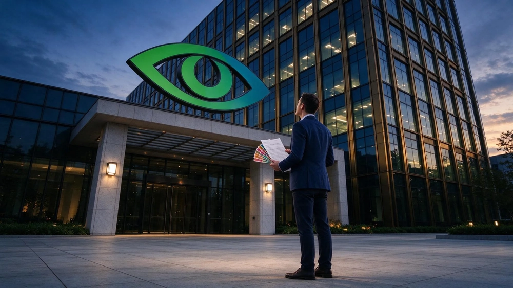
Nvidia logo debate for a video production company
As of November 2026, the short answer is that a new chief executive rarely requires a new logo, and Nvidia has not announced one. The board named Colette Kress interim CEO on 12 November 2026 after Jensen Huang resigned, and the debate about the mark that followed is a design argument raised on Creative Bloq, not a company decision. If you commission the work, a video production company or a design team should be asked to keep the recognition a logo has already earned.
Key takeaways
- Nvidia's leadership change and its identity question landed in the same week, and nothing official links the two.
- Recognition is the part of a logo you cannot buy back quickly, so the mark is usually the last thing a refresh touches.
- A refresh that changes type, colour and photography but keeps the mark is cheaper to govern and easier to measure.
- Short brand films carry a new look into paid media faster than a wordmark change does, and they are the part you can test.
- Budget for the rules and the templates first, then for the artwork.
What actually changed at Nvidia
Nvidia's own announcement, dated 12 November 2026, sets out the sequence without any reference to branding. Jensen Huang resigned as president, chief executive and board member with immediate effect. Colette Kress, executive vice president and chief financial officer, took the interim role and kept the finance job while the board looks for a permanent successor.
Kress has held the CFO role since she joined the company in September 2013, and she spent nearly 25 years in finance positions at technology companies before that. The board also appointed Harvey C. Jones as its first-ever chair; he had worked as an entrepreneur, executive and investor for over 30 years, including at Synopsys. In her statement, Kress said she would build on the foundation Jensen created over the last 33 years.
The company is on Nasdaq under the ticker NVDA and reports its third-quarter fiscal 2027 results on 17 November. None of that touches design. It does explain the timing of the article that raised the logo question days after the announcement, when a news story about succession gives a design writer a reason to revisit a mark everyone has seen for years.

Why a leadership change invites a logo question
A new leader is the moment when a company's own people start asking what the company is now. That question gets aimed at the logo because the logo is the cheapest visible answer. Change it and you look decisive; keep it and you look stable. Both readings are made by outsiders who cannot see the internal debate, which is the first reason to be careful with the timing.
The second reason is that succession news concentrates attention. Design threads and trade press pick up the story and a thirty-year-old identity suddenly has an audience. Creative Bloq's piece came out of a Reddit discussion among designers about the least well-designed corporate logos still in use, with Nvidia's spiral eye as the example that started it. That is a design-culture argument, and it would have been made in any week. It got published in this one.
The distinction matters for anyone copying the reasoning. Correlation in timing is easy to see; causation is not. Nothing in the company's announcement says the board discussed design, and the interim CEO's statement is about customers, partners, developers and shareholders.
Protecting recognition while modernising a logo
Recognition is a measurable thing if you define it before you start. Set the definition first, then the period you will compare. A workable set for a logo refresh looks like this:
- Cued recall: show the mark for a fixed time and ask which company it belongs to. Record the share who answer correctly.
- Spontaneous attribution: show a campaign frame and ask whose product it is, with no logo visible.
- Misattribution: record the share who name a competitor. This is the number a refresh most often damages.
- Time to recognise: measure how many seconds a respondent needs. Longer times show the mark is doing less work.
Run all four before the change on the same sample frame and the same stimulus set, then repeat them afterwards. Without a baseline, any claim that recognition held up is a belief. Advertising teams already use this logic when they talk about video ad optimization: the metric is defined first, the campaign runs, and the reading is compared with the same metric from before.
The hierarchy matters too. A logo is one asset beside the wordmark, the colour palette, the type family, the photography and the motion. A refresh that changes the mark and leaves the rest is not a refresh; it is a mark swap that will look off-brand in every layout it lands in. The reverse move, keeping the mark while rebuilding colour, type and photography around it, keeps recognition while changing how the brand feels. That is the option with the shortest list of things that can go wrong.
How to protect a recognisable logo when you modernise it, and what a rebrand costs in lost recognition
This is the part the design debate usually skips. The cost of a rebrand is not the artwork fee. It is the value of every place the old mark already sits and the time it takes for people to relearn the new one.
Five cost lines to put in the plan:
| Cost line | What it covers | How to size it before you start |
|---|---|---|
| Asset replacement | Signage, packaging, vehicle livery, office fronts, event booths | Count the physical sites and get removal and fitting quotes per site |
| Template rebuild | Slide decks, proposal covers, ad templates, email headers, subtitle styles | Count the live templates and the people who use each one |
| Media re-shoot | Photography and footage that shows the old mark or the old colour | Count assets still in rotation and their remaining planned use |
| Search and social equity | Profiles, thumbnails, channel art and paid creative that carry the mark | List every channel that shows the mark and who updates it |
| Internal relearning | The weeks when staff approve work against rules they are still learning | Time the first two approval rounds against the old ones |
Recognition loss shows up in that last row and in the numbers from the recall test. A mark swap that lands in the middle of a busy media schedule can cost more than the artwork, because every creative produced before the change needs a decision about whether it can still run. There is nothing wrong with the number being small or large; the failure is deciding without one.

Should a leadership change force a visual break?
Sometimes the answer is yes, and the reason is never the calendar. A new leader may need a visible break when the old identity is tied to a specific controversy, or when the business has moved to a different market and the old look misrepresents what it sells. Neither condition is automatic, and both are arguments someone has to make with evidence.
The test I would apply is simple. Ask which audiences would read a changed logo as a statement about the company, then ask how many of them would read it as anything else. If the answer for most audiences is that the mark just looks slightly different, the change is decoration. If a large share of the audience would read it as a judgement on the past, the change has a job and the brief needs to say what that judgement is.
There is also the option that the coverage itself suggested. Keep the eye, adjust the type and find a better shade of green. That is an evolution, and evolutions are cheap to govern because the governing rules change in a few places rather than everywhere. The recognition test above will tell you what an evolution bought you; the template count will tell you what it cost.
How Topkee scopes a logo refresh and the creatives around it
Topkee treats identity work as a governed system rather than a single artwork, which is the useful contrast for a team weighing an Nvidia-style refresh. In its practice, brand consistency is defined around unified logo, brand colours, fonts and image assets maintained across scenarios and social platforms; swapping the mark without aligning colour, type and imagery does not count as a rebrand. Its brand-manual service works through requirement analysis of brand information, use cases, audience and market positioning, then asset selection and retouching, addition of brand elements, motion graphics built with replaceable placeholders, and review rounds checked against the client's visual guidelines. The yBrand asset library holds the palette, fonts, logo and positioning but supplies rules only: it generates no slides, pages or images, and auto-selected colours and copy remain editable drafts.
The delivery side is where that matters for a marketing team. Topkee's creative subscription runs on a monthly deliverables list from S$590 a month, and films on the standard plans run up to 15 seconds; sizes, languages and revision rounds are confirmed before the service starts. Video work follows a five-stage process ending in delivery and feedback, and short-form cuts are made to vertical specs for Reels and Shorts with subtitles placed for the platform's safe margins. For a refresh that has to appear in paid media the following month, a monthly output list with confirmed versions and feedback records is how the new rules reach the work without every asset being negotiated again.
An afternoon's way to size the decision
Before anyone opens a design file, take a single afternoon and do the counting.
- Export every live template and list who owns it.
- Pull the last quarter's creative and mark which assets carry the mark, the old colour or both.
- Run the recall test on a small sample of customers with the current mark.
- Ask the media buyer which planned campaigns would need new assets if the colour changed.
- Read the list back and decide whether the refresh is a mark change or a system change.
The output is not a design. It is a figure your finance lead can argue with, which is the point of doing it. For a Singapore team briefing a video production company, that figure also sets the brief's scope: how many films, at what run time, in how many language versions, and what the first month has to deliver. Teams that buy production in this way can compare a per-project quote against a monthly output plan, as this account of buying video production well sets out.
The part a short film buys you
A wordmark change is a slow instrument. People see it when they next visit a page or open an app. A short film of the kind a video production company delivers meets them where they already are, in a feed they are scrolling, and it can carry the new colour, the new type and the new tone in one placement.
That makes it a testbed. Produce the refresh in a small number of cuts, run them against the old creative in the same audience, and read which version holds attention. The measure has to be defined before the run: for example, the share of viewers who watch past the first two seconds, compared with the same share for the previous creative in the same placement and period. That is a comparison a media buyer can trust, and it gives the brand owner something to show the board besides taste.
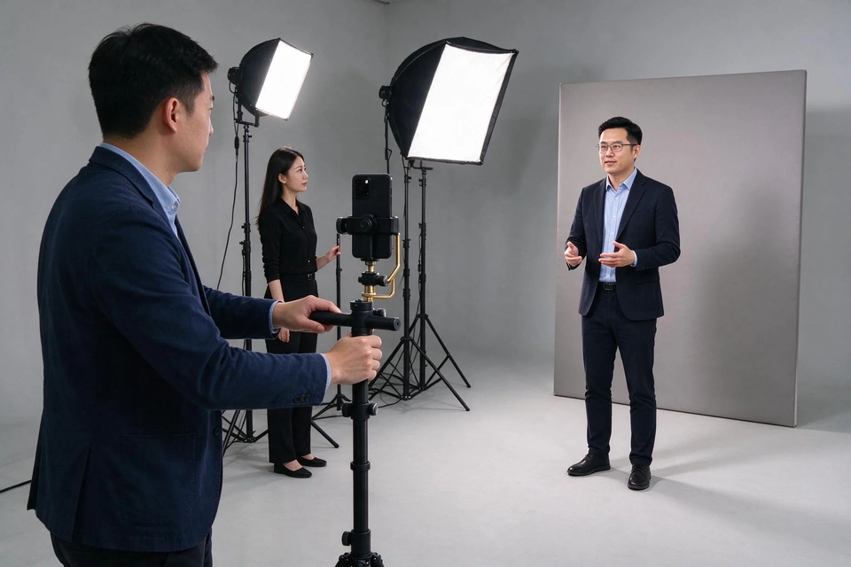
Short works differently from long here. IG Reels and YouTube Shorts run vertical, and the first one or two seconds carry the decision to keep watching; a video production company cutting for those slots works to the platform's specs; horizontal edits dropped into that slot lose the subtitle placement and the margins they were built for. A refresh that ignores the format rules will look new and perform worse, which is why the production brief has to name the placements before the designer names the colour.
What to tell the board
Give them three sentences and a number each. What the refresh changes, measured against the list of assets it touches. What the recognition test showed before the change, on a stated sample. What the first month of live creative will prove, with the placement and the metric named.
That framing keeps the conversation away from who has the better eye. It also answers the question Nvidia's coverage raised in a way a company can act on. A new CEO may or may not need a new logo; the decision needs a definition and a baseline, and the rest is production. When the campaign runs, plan the video ad optimization around a metric you fixed beforehand.
If your refresh will carry into paid media, read how a Tropfest brief shaped a video production plan before you write the deliverables list.
FAQ
Does a new CEO mean a company should rebrand?
No fixed rule links the two. A leadership change is a reason to ask the question, and the answer comes from evidence: whether the old identity misrepresents the business, and whether a large share of the audience would read a new mark as a statement about the company.
Is Nvidia actually changing its logo?
Nvidia has not announced any logo change. Its announcement of 12 November 2026 covers the resignation of Jensen Huang, the appointment of Colette Kress as interim CEO and Harvey C. Jones as board chair. The logo question came from design commentary published afterwards.
How do we measure lost recognition after a logo refresh?
Run a cued recall test, a spontaneous attribution test and a misattribution count on the same sample before and after the change. The misattribution figure is the one that shows whether people now confuse you with a competitor.
How much does a logo refresh cost in Singapore?
The artwork fee is the smallest part. Count the physical sites that carry the mark, the live templates, the footage in rotation and the channels that need new art, and quote each line. A monthly creative plan starting at S$590 covers recurring graphics and short films, which is the part most refreshes need on an ongoing basis.
Should we change the logo, the type or just the colour first?
Change the rules first, then the assets that break most visibly. Rebuilding colour, type and photography around an existing mark keeps recognition while changing how the brand feels, and it is cheaper to govern than a mark swap.
Sources
- "Does Nvidia need a new logo as well as a new CEO?", Creative Bloq, 13 November 2026. https://www.creativebloq.com/news/does-nvidia-need-a-new-logo-as-well-as-a-new-ceo
- "NVIDIA Announces CEO Transition", NVIDIA, 12 November 2026. https://nvidianews.nvidia.com/news/nvidia-announces-ceo-transition
- "Nvidia DLSS 5 in Hogwarts Legacy makes the AI backlash seem funny", Creative Bloq, 5 November 2026. https://www.creativebloq.com/news/nvidia-dlss-5-in-hogwarts-legacy-has-sparked-a-whole-different-controversy
- "Good Creative, Keeps Happening", Topkee, undated. https://www.topkee.com.sg/creative-subscription